Brand Design: Brand Typography and Hierarchy
Typography is the key to unlocking the visual DNA of your brand, how your message is received by your audience. As small business owners and entrepreneurs trying to make your mark in a crowded market, understanding and using typographic hierarchy can be a game changer in differentiating your brand.
Typographic Hierarchy
At its simplest, typographic hierarchy is about structuring your content so the reader’s eye is guided and the most important information is emphasised. It’s the art of arranging text elements to create a visual hierarchy that grabs attention and communicates your brand story.
The Three Levels of Typographic Hierarchy

Level One: Grab Attention
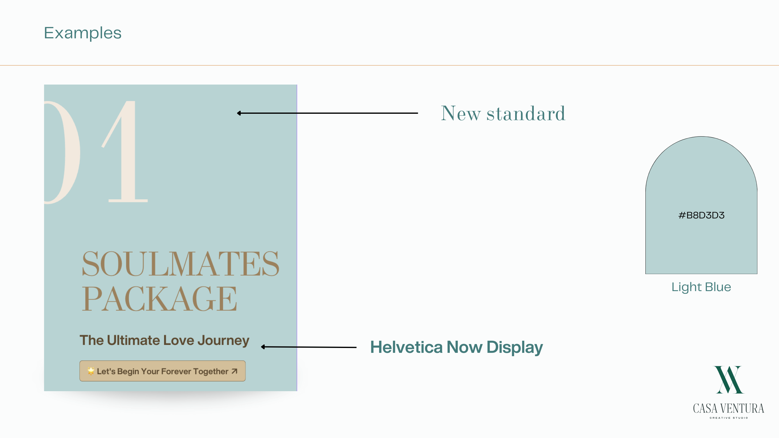
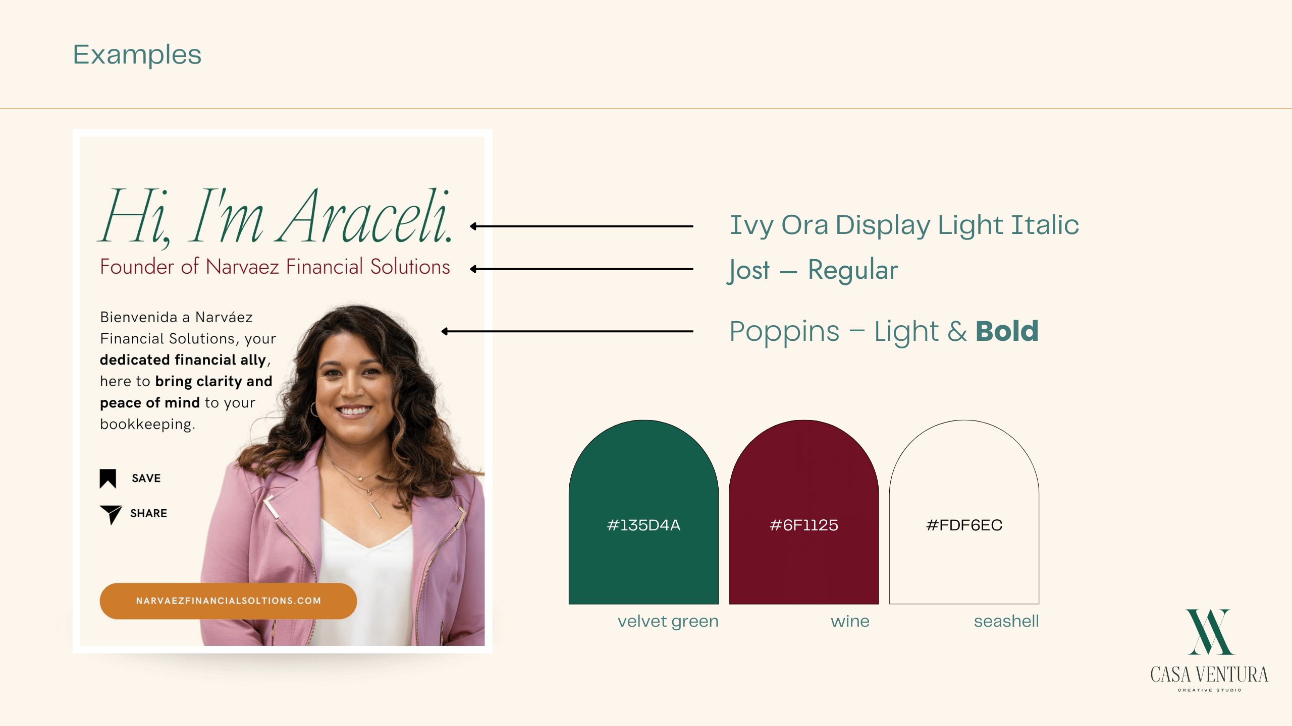
Your level one typography is the entrance to your content. This is where you make a big statement, using large and bold fonts to grab the reader’s attention and point them to the key message you want to get across.
Level Two: Guide Through Sections
Level two typography is the support act, guiding the reader through different parts of your content. Subheaders and secondary details fall into this category, providing structure and context to the overall story.
Level Three: Get into the Nitty Gritty
Dive into the meat of your message with level three typography. Here you can elaborate on your products, services or insights in more detail, using smaller font sizes but still keeping it readable and coherent.
Your Typographic Identity
To master typographic hierarchy and get personality and purpose into your brand design try:
Mix Typefaces and Weights
Use different typefaces and weights within a font family to create contrast and visual interest while keeping it all looking cohesive across your brand assets.
Play with Font Sizes
Use font sizes strategically to guide the reader through your content. Start with big headlines and gradually go smaller for secondary information.
Use White Space
Use plenty of white space in your designs to make it readable, create visual breathing room and so each element stands out in the layout.

Use 2-3 Typefaces for Contrast
Pair typefaces, like sans-serif and serif, to create contrast and hierarchy while keeping it all harmonious across your brand materials.
Harness the Power of Color
Use color strategically to highlight important elements, evoke emotions and separate content sections. Remember a balanced color palette is more appealing than overwhelming.
Organize with Spacing
Use spacing to relate design elements, group related content logically and create flow and balance in your layouts.

Experiment with Text Variations
Try different text treatments like tilting text, wrapping patterns or subtle style changes to add visual interest and grab attention.
Adjust Letter and Line Spacing
Fine tune letter and line spacing to make it readable and visually appealing. Small adjustments can turn cluttered layouts into beautiful, sophisticated designs that engage and inform.
Use Blocks of Color and Shapes
Use blocks of color and geometric shapes sparingly to highlight content, quotes or calls to action and draw the eye and add to the overall impact of your brand messaging.

As you design your brand, remember typography is a powerful way to express your brand’s voice, values and identity. Love typographic hierarchy and shape a visual language that speaks to your audience on a deep level. By mastering typographic design you’ll not only make your brand look good but also craft a story that grabs hearts and minds. Let your typography do the talking and tell your brand’s story with flair.