How to Build Highly Converting Opt-in Forms with Flodesk
As a business owner you know building an email list is the foundation of marketing. Email marketing is one of the most powerful ways to connect with your audience and make sales. One of the best way to grow your email list is through opt-in forms that actually work. With Flodesk you can create beautiful high converting forms that capture leads and grow your business.


Ready to level up your opt-ins? Use my Flodesk code PATYVENTURA to get started and save! Let’s get into how you can build opt-in forms that grab attention and convert visitors into loyal subscribers.
1. Write Headlines That Hook
Your headline is the first thing visitors will see when they land on your opt-in form, so make it count! Here’s how to create headlines that grab:
Clarity Over Cleverness
While clever is great, clarity should be your top priority. Your headline should clearly state what your subscribers will get. Avoid vague phrases and go for straightforward language that speaks to your audience’s needs.
Highlight the Benefits
Focus on what your audience will get. Whether it’s exclusive discounts, valuable tips or insider info, make the benefit obvious. For example instead of “Sign Up for Updates” say “Get Exclusive Tips to Grow Your Business!”
Create Urgency
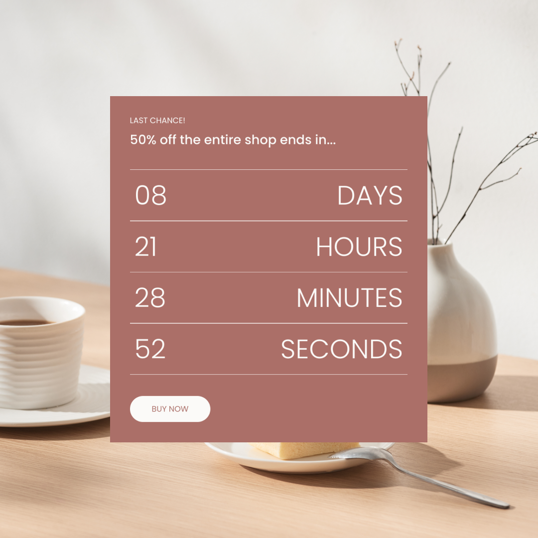
When applicable add a sense of urgency to encourage immediate action. Phrases like “Limited Time Offer” or “Join Now to Secure Your Spot!” will prompt users to act fast and not miss out.
Here are some Headline Examples:
- “15% Off Your First Purchase – Subscribe Today!”
- “Weekly Marketing Secrets in Your Inbox – Join Now!”
- “Don’t Miss Out... Subscriber Only Content!”


2. Choose Colors That Pop
Color psychology plays a big role in how your audience perceives and interacts with your forms. Here’s how to choose colors that stand out:
Stick to Your Brand
Make sure your form’s colors match your overall brand colors. This builds brand trust and looks cohesive. If your brand has bright colors, go for it!
Create Contrast
Make your call-to-action (CTA) buttons stand out by using contrasting colors for the text and background. For example if your background is light go for dark text and bold buttons and vice versa.
- Color Psychology 101:
- The color Blue: Evokes Trust
- The color Red: Creates Urgency
- The color Green: Promotes Growth
- The color Yellow: Reflects Optimism
Try out these combinations and see what works best for your audience.

3. Optimize Pop-Up Timing
Pop-up timing can make or break the user experience. Here’s how to get it right:
Delay Your Pop-Ups by 30 seconds
Instead of showing the form the second someone lands on your page, set it to appear after a few seconds or once they’ve scrolled a certain percentage down the page. This gives visitors time to engage with your content before you ask for their info.
Use Exit-Intent Pop-Ups
These pop-ups appear when a user is about to leave your site, giving you one last chance to grab their attention. This is great for capturing those about to bounce visitors.
Control Frequency
No one wants to see the same pop-up over and over. Set frequency limits so returning visitors aren’t bombarded with the same form on every visit.
4. Keep It Simple
Less is more when it comes to opt-in forms. Simplicity equals higher conversions. Here’s how to simplify your forms:
Fewer Fields, More Sign-Ups
Only ask for what’s absolutely necessary. A name and email address is often all you need. The fewer fields to fill out the less resistance from potential subscribers.
Mobile Friendly Design
With mobile traffic on the rise make sure your forms are responsive. Test them across different devices to ensure they look and function great on smartphones and tablets.
Short and Sweet Copy
Keep your messaging concise and focused on the value. Use bullet points to highlight the benefits and avoid long winded text.

5. Testing for Optimization
After you launch your form, keep optimizing! Testing helps you figure out what works for your audience. Here’s what to test:
Headlines
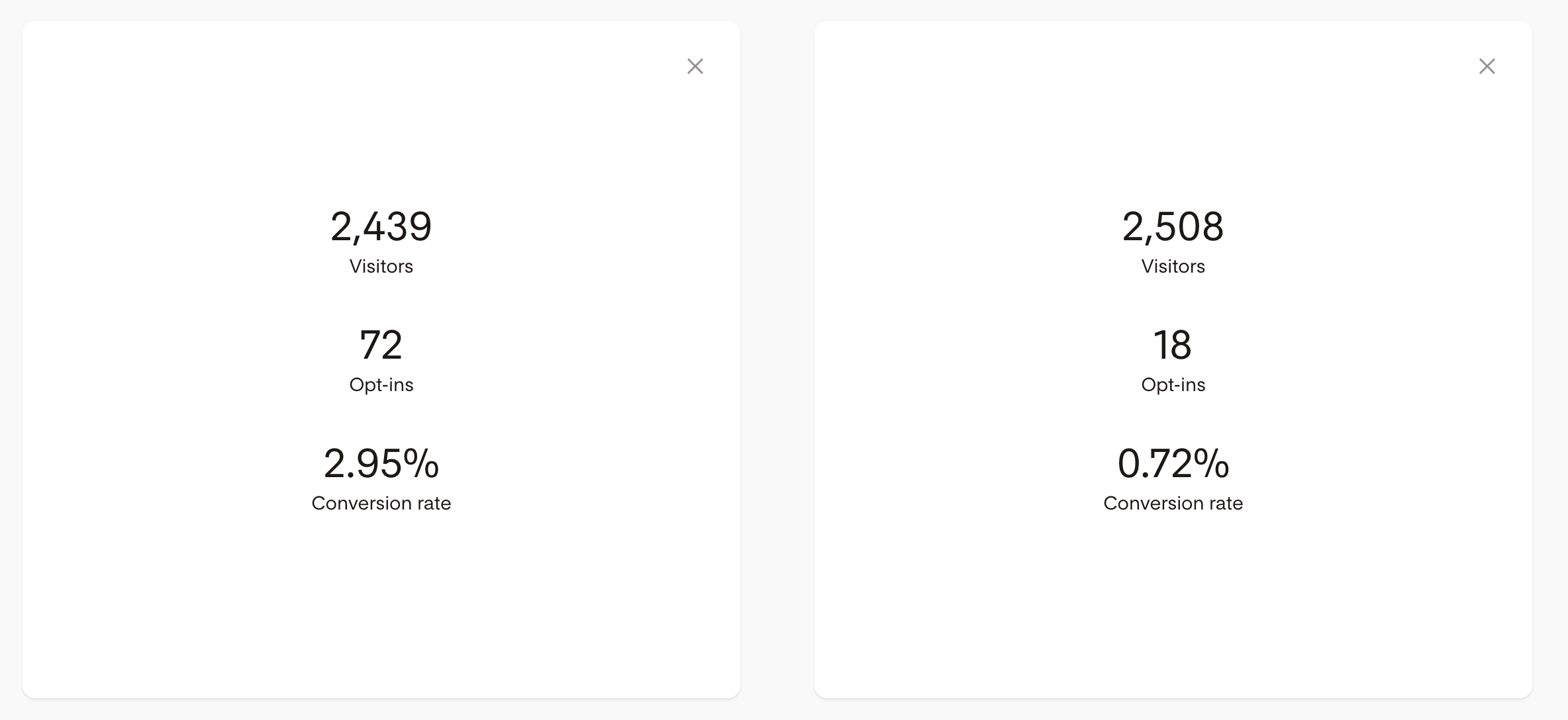
Try out different versions of your headline to see which one gets more sign-ups. Even slight changes in wording can make a difference.
Colors and Layouts
Test different color schemes and form layouts to see which one gets the most attention.
Pop-Up Timing
Experiment with different timing to find the sweet spot that converts without annoying your visitors.
Monitor Analytics
Use Flodesk’s built-in analytics to track your forms. Review the data regularly to make informed decisions on what to tweak.
6. Offer Value Beyond Sign-Ups
People love free stuff so give them a reason to sign up by offering extra value:
Exclusive Content
Share a free downloadable resource like an e-book, guide or template as a sign-up incentive. This gives immediate value to your subscribers.
Subscriber-Only Discounts
Offering a discount on their first purchase is a great motivator. For example, 10% off when they join your list.
Regular Insights
Let subscribers know they’ll get valuable tips, insights and updates on topics they care about. The ongoing value will keep them engaged and loyal.

Get Started with Opt-in Forms?
Flodesk helps you create gorgeous, high-converting forms that grow your email list and get real results. Focus on your headlines, colors, timing, simplicity and A/B testing to optimize for success and don’t forget to offer value beyond the sign-up!
Ready to get started? Use my code PATYVENTURA to try Flodesk today and start building forms that blow your audience away and supercharge your business.
Happy Emailing! 🥰


