How storytelling, color, and typography built one of the most inspiring campaigns of the year
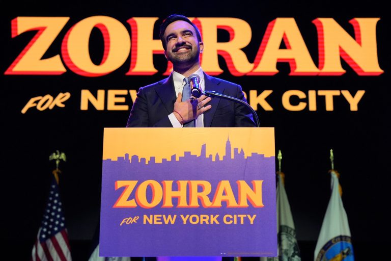
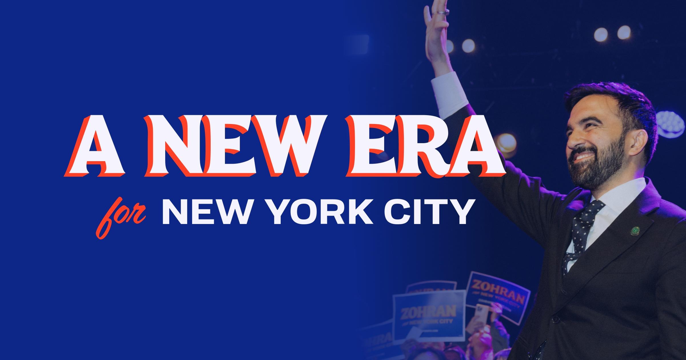
When I first saw the Zohran Mamdani for New York City campaign, I stopped scrolling. It wasn’t just another political ad. It was art with intention. The colors, the typography, the patterns — everything felt alive and connected.
This campaign is one of the best examples of what happens when design, storytelling, and strategy work together.

How Design Shapes Emotion
Great branding makes you feel something before you even read a word. Every element of the Zohran Mamdani campaign told a story about community, progress, and belonging.
Good branding doesn’t just show up. It shows who you are.
Every detail in the Zohran Mamdani campaign, from the logo to the signage, told a story about community, pride, and possibility. It captured the rhythm of New York in a way that felt authentic, not performative. It’s the kind of design that reminds you that when you brand with heart, you don’t need to shout. People just feel it.
Color Psychology in Branding: Blue, Yellow, and Red as Symbols of New York
The campaign’s palette wasn’t chosen by accident. It used the three colors that define New York: blue, yellow, and red. Each carried both emotional depth and local meaning.
- Blue symbolizes trust and unity in traditional color psychology, but in New York, it’s the color of the MTA buses that move the city every day. It represents public access and connection, the everyday motion of millions of lives.
- Yellow stands for optimism and creativity, but in New York, it’s the color of taxi cabs and the iconic MetroCard. It’s fast, vibrant, and unapologetically urban, the pulse of the city that never stops.
- Red conveys passion and urgency, and in this campaign, it also echoed the energy of the subway system, raw, bold, and always in motion.
Together, these colors didn’t just create harmony. They told a story about belonging to the city itself. That’s what made this campaign stand out. It wasn’t branded for New York. It was branded from New York.
Zohran Typography in Design: Giving New York a Voice
Typography was the backbone of this campaign’s storytelling. Each font served a purpose: emotional, visual, and cultural.
- Union Gothic carried the strength and grit of classic New York signage. It’s the type you’d see on subway walls, storefronts, and street signs, timeless, bold, and direct.
- Coffee Service, the hand-drawn script, brought warmth and familiarity. It felt like the lettering on a local bodega window or a neighborhood café, homey, human, and deeply personal.
- IBM Plex Serif added balance and structure, grounding the campaign in logic and clarity.
- Boheld, chosen as a nod to Mamdani’s South Asian heritage, introduced subtle flair that was expressive but not overpowering. It blended cultural identity with modern design.
This is typography done right. It wasn’t trying to be trendy. It was trying to be true.

Building Trust Through Consistency in Branding
The entire visual system, from posters and merch to social media and web design, carried the same heartbeat.
The repetition of color, type, and illustration built familiarity. You could spot a Zohran Mamdani campaign design from a block away and instantly know what it stood for.
That’s the quiet magic of strong branding. It doesn’t just look good once. It feels consistent everywhere. Consistency isn’t about perfection. It’s about clarity.

Campaign Design Inspiration for Creatives and Founders
Whether you’re a designer, a founder, or a strategist, there’s something to take from this campaign: your visuals are your voice. They tell people who you are before you ever get to explain it.
When you invest in original branding, you’re investing in the emotion people feel when they see your work: trust, curiosity, excitement, recognition. That’s what great design does. It bridges intention and impact.
Credit and Creative Sources
This analysis highlights the incredible creative work behind the Zohran Mamdani campaign design, created by Designed by Forge, photographed by Kara McCurdy, and featuring typography by Matthew Hinders Anderson
I did not design this campaign. I simply put together a Canva mood board to study and celebrate it as a creative resource for fellow designers, strategists, and brand lovers who appreciate storytelling through design.
Final Thoughts: Design That Moves People
The Zohran Mamdani for New York City campaign wasn’t just design. It was storytelling with purpose. It reflected what branding is really about: understanding people, places, and emotions deeply enough to create something that feels like home.
When art meets purpose, you don’t just see it. You feel it.
Support original design. Celebrate the artists and studios behind the work.
And when you’re ready to build something that lasts, invest in branding that moves people, not just algorithms.